Alan Mauger and Christie Gerrard
Geological Survey of South Australia, Department for Energy and Mining
Download this article as a PDF (4.1 MB); cite as MESA Journal 92, pages 19–25
Published July 2020
Introduction
New functionality enabling improved visualisation has been added to the National Virtual Core Library (NVCL) layer, also referred to as the HyLoggerTM layer, in SARIG, the South Australian Resources Information Gateway. South Australia’s node of the NVCL now boasts over 1,100 drillholes with hyperspectral data and high-resolution imagery available for free download to help explorers identify prospective areas for mineral deposits.
Hyperspectral tools such as the HyLogger use reflectance spectroscopy to interpret detailed mineralogical information from drill core and drill cuttings. Reflectance spectra are measured over a range of wavelengths from visible-near infrared through short-wave infrared to thermal infrared enabling the detection of many common rock-forming and alteration minerals. Continuous high-resolution digital colour imagery of the drill core is also captured.
The Geological Survey of South Australia has been using the HyLogger system since its initial trials in 2002, and South Australia now boasts the second largest number of scanned drillholes in Australia. The NVCL is supported by CSIRO and the Australian Government through the National Collaborative Research Infrastructure Strategy.
This article takes you on a virtual tour of the latest HyLogger features in SARIG demonstrating the new functionality and providing an overview of information available for querying and interrogation. This new functionality enables initial assessment of spectral data before download where full analysis can take place in appropriate software (eg The Spectral Geologist)
New functionality
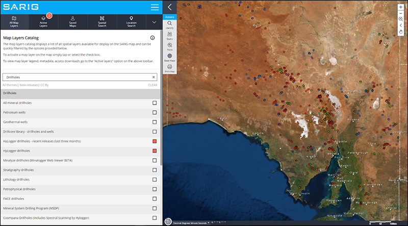
HyLogger drillholes are displayed under Drillholes in the Map layers Catalog (Fig. 1). Recent activity is also recorded on a separate layer so clients can identify additions to the database that have occurred in the last three months.
The new changes become apparent when individual holes are interrogated. The shortcut URL https://minerals.sarig.sa.gov.au/Details.aspx?DRILLHOLE_NO=612&TAB_NO=6 delivers you directly to the spectral data of the hole in question. Merely substitute the required unique drillhole number in the above string replacing the 612.
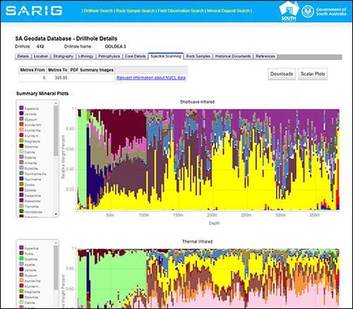
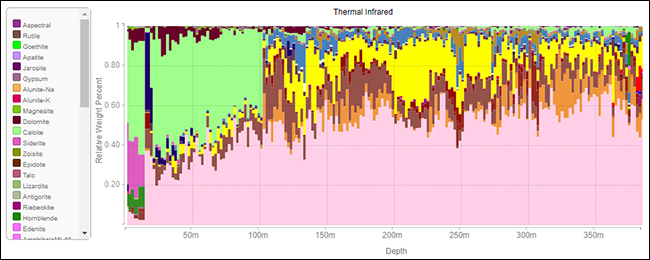
The opening page now presents the summary mineral interpretation for the entire hole – both the shortwave infrared minerals and where available, the thermal infrared minerals (HyLogger-3; Fig. 2). The colour legends for the plots are provided on the left hand side.
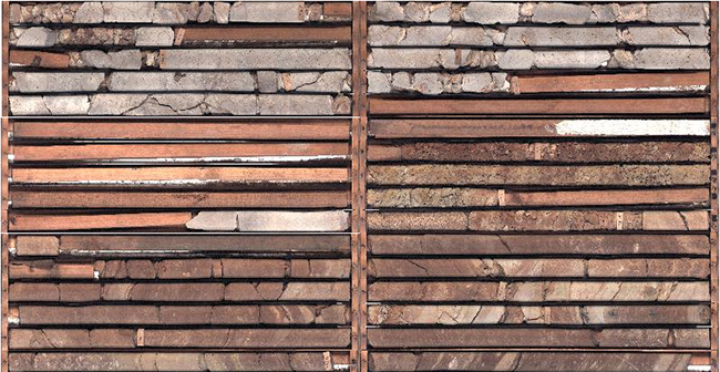
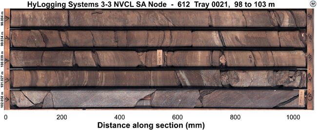
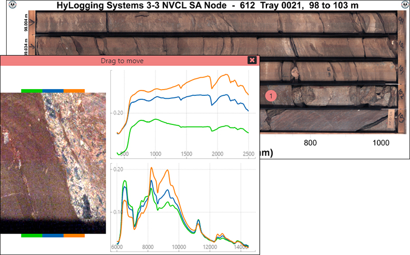
While on this page, you can scroll down to the tray pictures (Fig. 3). Left-mouse clicking within a tray picture reveals a new style of plot – the tray carousel (Fig. 4). This high-resolution image can be captured to your computer with right-mouse click – copy image or save image. Left-mouse click, however, and two graphs appear (Fig. 5). One showing shortwave infrared reflectance spectra and the other thermal infrared reflectance spectra. Each spectra is colour coded to the zoom-in, high-resolution image to the left which identifies which pixel each curve belongs to (note the colour bars at the top and bottom of the image). If you hover your mouse over a graph the appropriate section of image is illuminated. Multiple graphs can be open for one tray and the locations are marked accordingly.
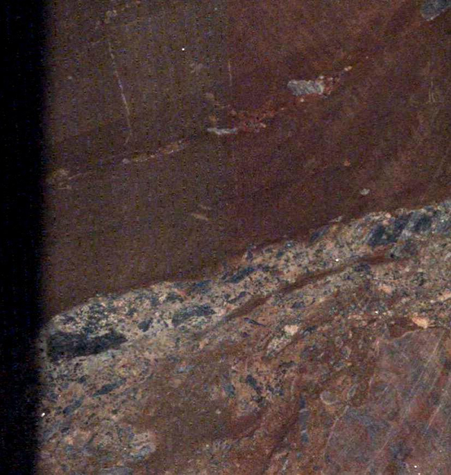
If you left-mouse click on the image again an even greater enlargement of those five pixels is offered for download (Fig. 6).
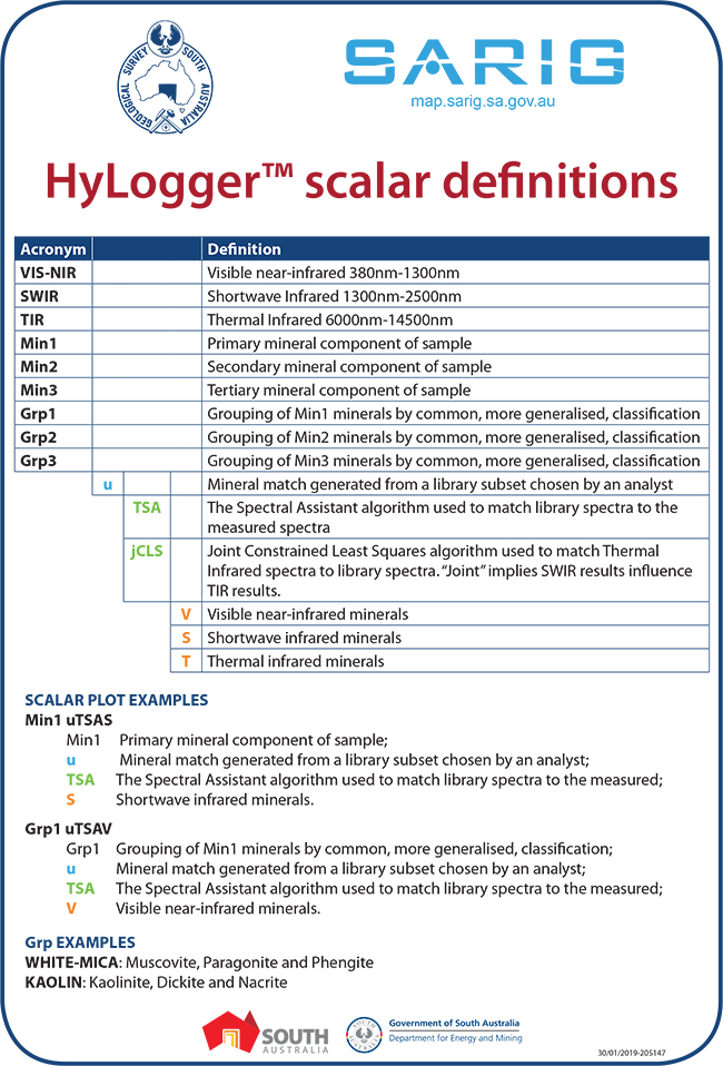
The other major development is found under the scalar plots option on the top right of the opening or landing page for the drillhole (Fig. 2). To understand the acronyms you may wish to first download the scalar definitions as a PDF (Fig. 7) and keep them by your side as you navigate the various options. Note that if assays have been loaded on the NVCL with these holes the assays will not be available through this plot function. To access the assays you will need to download the drillhole via the download option.
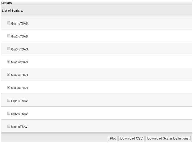
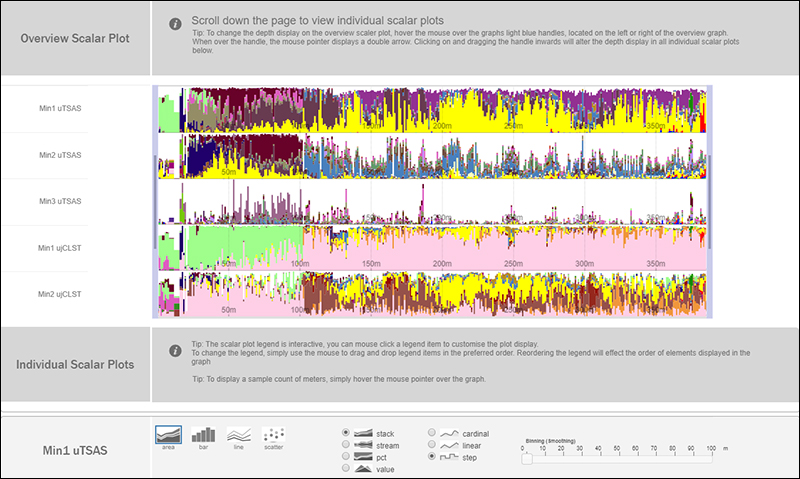
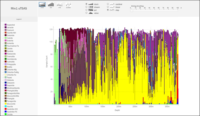
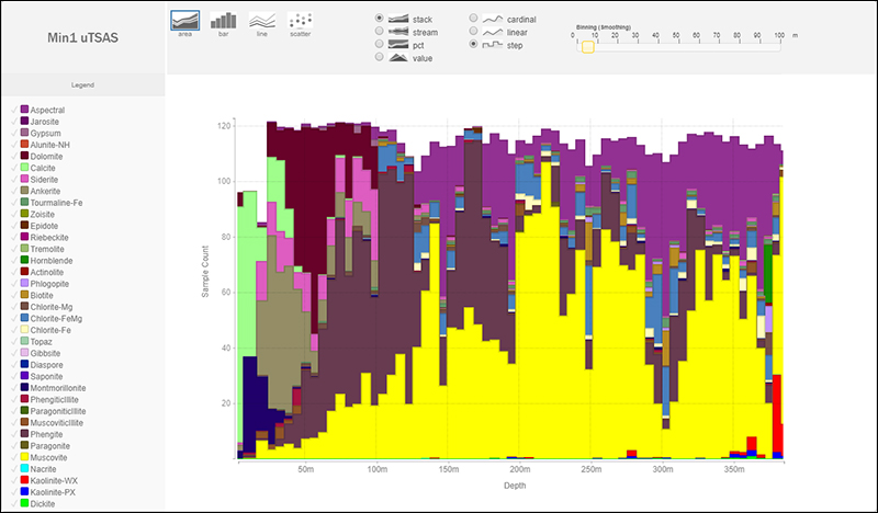
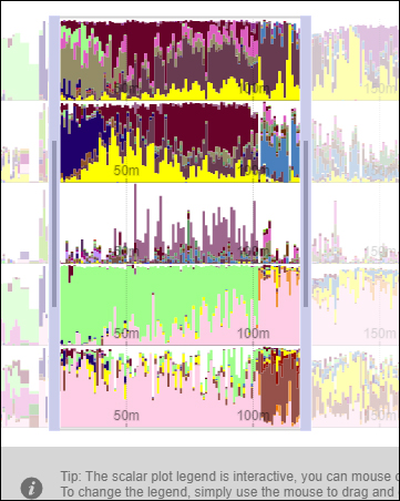
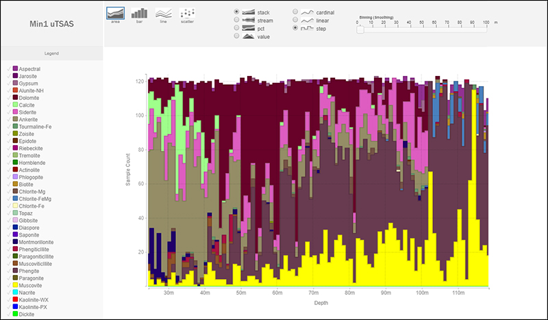
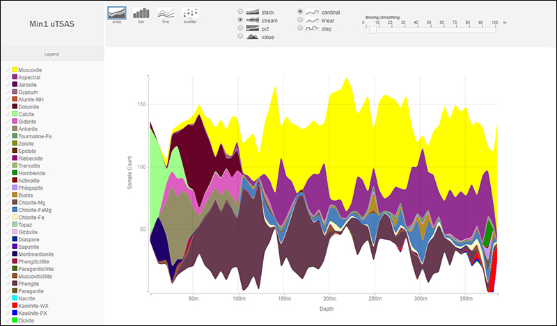
Simply by ticking the scalars you wish to interrogate and then the Plot button (Fig. 8), the data is presented in a more detailed format (Figs 9, 10). The resolution of the histogram can be adjusted with the Binning (Smoothing) tool on the top right of the graph (Fig. 11). Various parts of the hole can be interrogated in more detail (Figs 12, 13) and by hovering over the legend various components can be highlighted at will, and removed at will, using the tick option in the legend.
Note that the summary screen version on the landing page incorporates consolidated Min1, Min2 and Min3 to offer the complete picture while the scalar plots break down the analysis into principle, secondary and tertiary components. In addition, there are various forms of plot tailored to meet your needs and the level of detail can also be adjusted dynamically (Fig. 14).
Conclusion
New functionality built into SARIG enables user-friendly visualisation of millions of downhole spectral measurements from across South Australia. While only intended as a tool to aid initial assessment, this new capability enables a rapid method to gain access to drillhole imagery, downhole mineralogy and most importantly, new geological insight.
Acknowledgements
The remarkable versatility now offered by this site is due not only to the skill of SARIG’s programmers but also the underlying tools being offered by the AuScope portal developers who generously share their code with those who have an interest in portal development.


